Introduction
Wedding signs do more than just look pretty — they actually make the whole wedding day flow more smoothly. Whether it’s a welcome sign that sets the tone as guests arrive or a seating chart that helps everyone find their place, signs play both a decorative and practical role. The right ones not only add to the overall wedding aesthetic but also help guide your guests through the day, making everything feel organized and stress-free.
Types of Wedding Signs
Welcome Signs
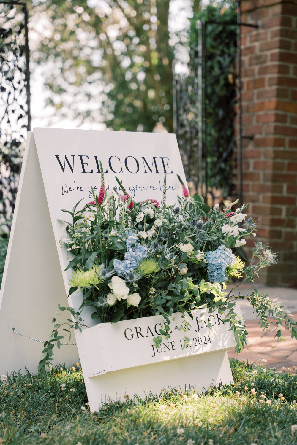
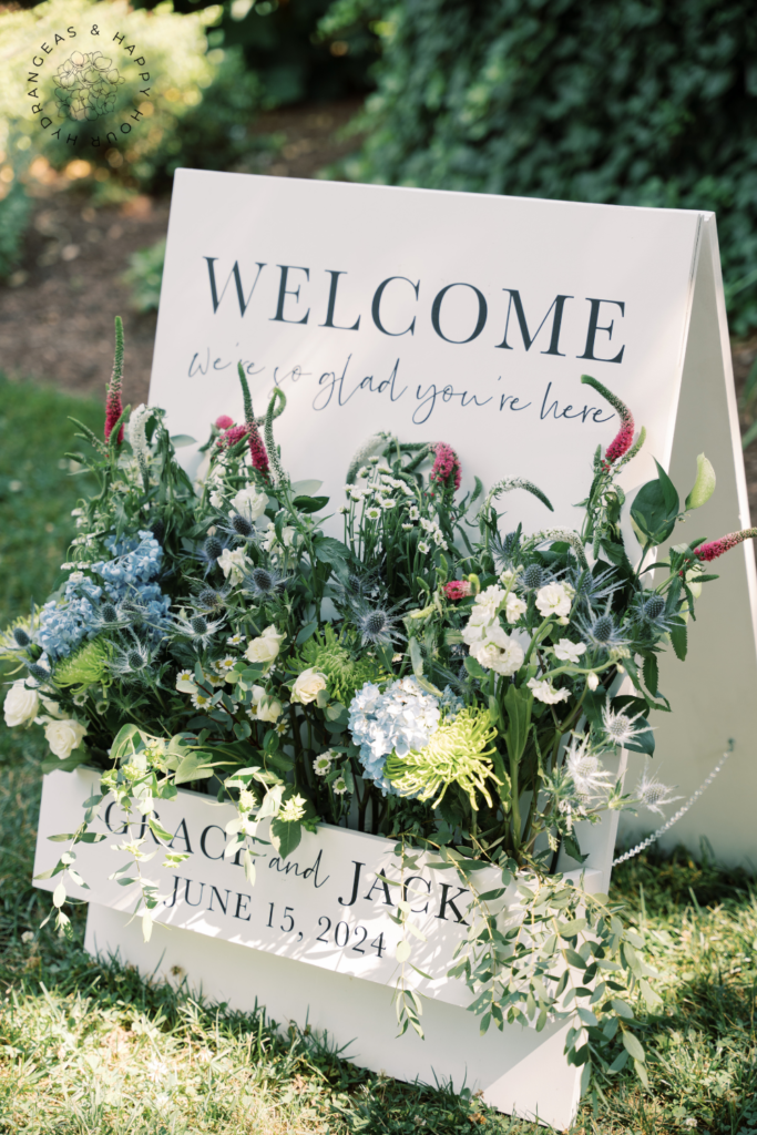
Welcome signs are one of the first things guests see when they arrive, so they’re perfect for setting the tone right from the start. Whether you’re going for a rustic, elegant, or modern vibe, your welcome sign can reflect that. Popular materials like wood, acrylic, chalkboard, and even mirrors give you plenty of options to match your wedding theme. You can keep it simple with just your names and the wedding date, or add a personal touch with a meaningful quote. It’s a small detail, but it goes a long way in making guests feel welcomed and excited for the celebration ahead.
As you often see throughout my blog and website, I will share some wedding signage from my daughter’s wedding. We did a wood window box style welcome sign. My (now) son in law made it following easy plans we found on Etsy. We added a plastic insert in the window box, with some wet oasis, and I added flowers I purchased at Trader Joes. It was beautiful and really set the tone as our guests arrived at the venue.
Pin for Later 📌
Reception Seating Charts
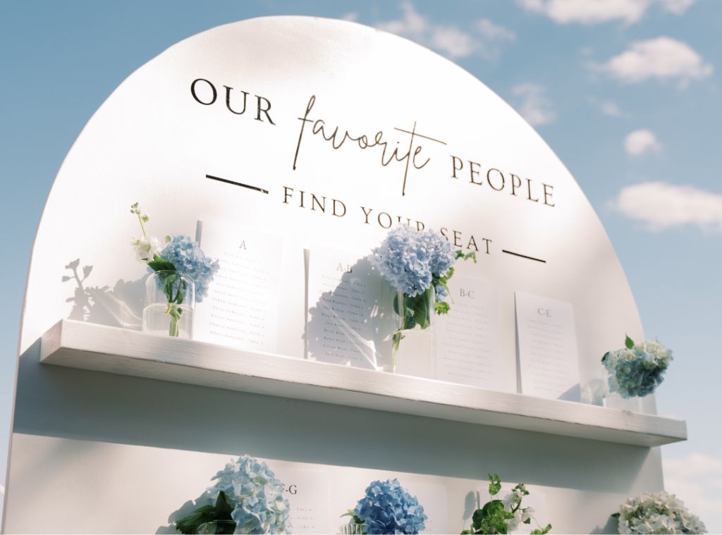
A well-organized seating chart helps everything run smoothly at your reception by guiding guests to their assigned seats without confusion. But just because it’s functional doesn’t mean it can’t be stylish! You can get creative with the display — try a mirror with hand-lettering, an old rustic window pane, or wooden boards that fit your theme. Whatever you choose, make sure the names are easy to read and the layout is clear, so guests can quickly find their seat. It’s all about blending function with style, keeping things efficient while still making a statement.
TIP: I recommend sharing the names and their table in alphabetical order (vs. by table number). It’s so much easier for guests to find their name that way and helps prevent a backup at the seating chart area.
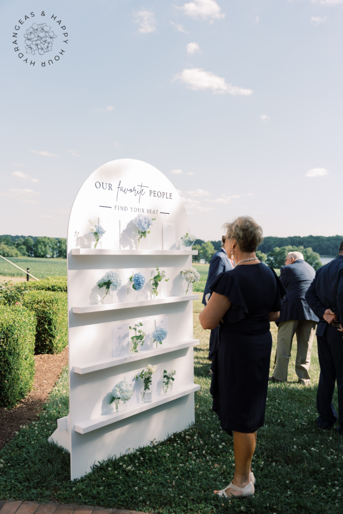
The image below shows the seating chart we made. Again, my son in law made this. He actually came up with the plans based on some photos we shared. We included everyone’s names and table number on 5×7 cards on the shelves and added the bud vases for decoration. We placed the sign outside the tent entrance so our guests would easily find their seat.
Pin for Later 📌
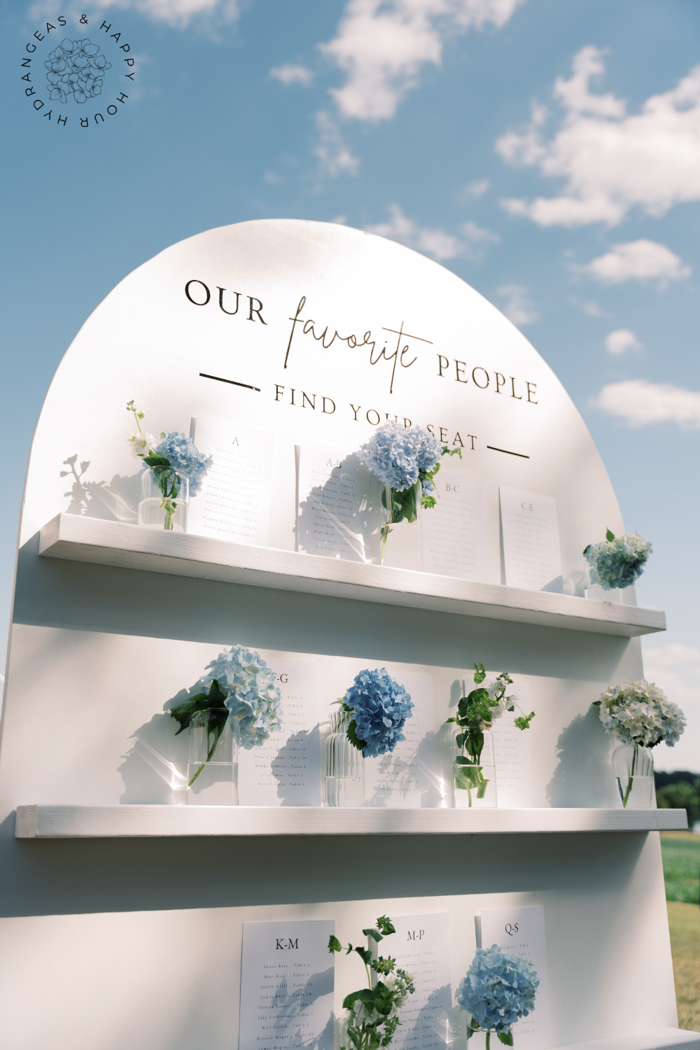
Table Number Signs
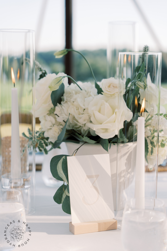
Table number signs are another functional piece that can also serve as a decor element. You can go classic with framed numbers, sleek with acrylic blocks, or rustic with wooden plaques. We used a basic wooden block and pretty cream embossed paper. To really make them stand out, match the table numbers to your wedding theme, or get creative and swap numbers for something more personal, like photos of places you’ve been or meaningful landmarks. They’re a small but essential detail that ties your reception decor together while helping guests find their spots easily.
Pin for Later 📌
Other Small Signage Throughout the Day
- Reserved Seating Signs are a great way to ensure you have saved space for your most special guests and family.
- A sign at the guest book encouraging your guests to stop and leave a note is a great way to catch their attention.
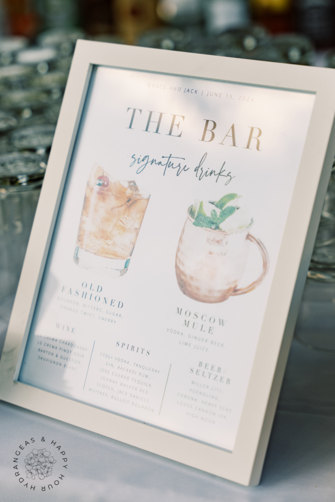
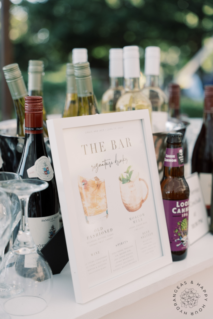
- Bar Menus help keep the bar line moving and can also share the couple’s signature drinks.
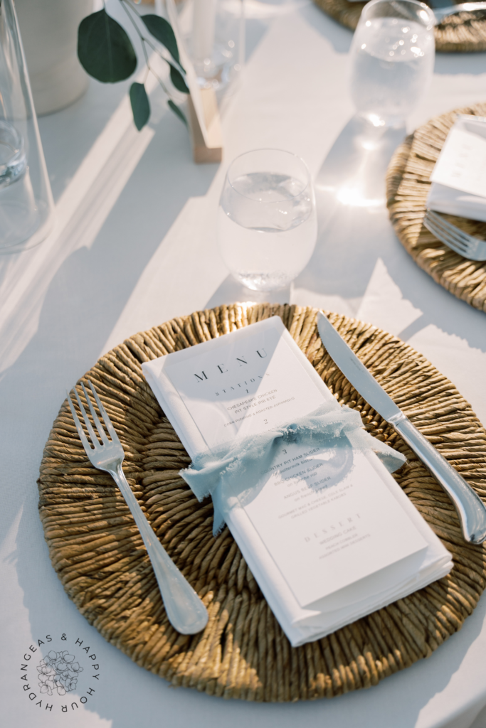
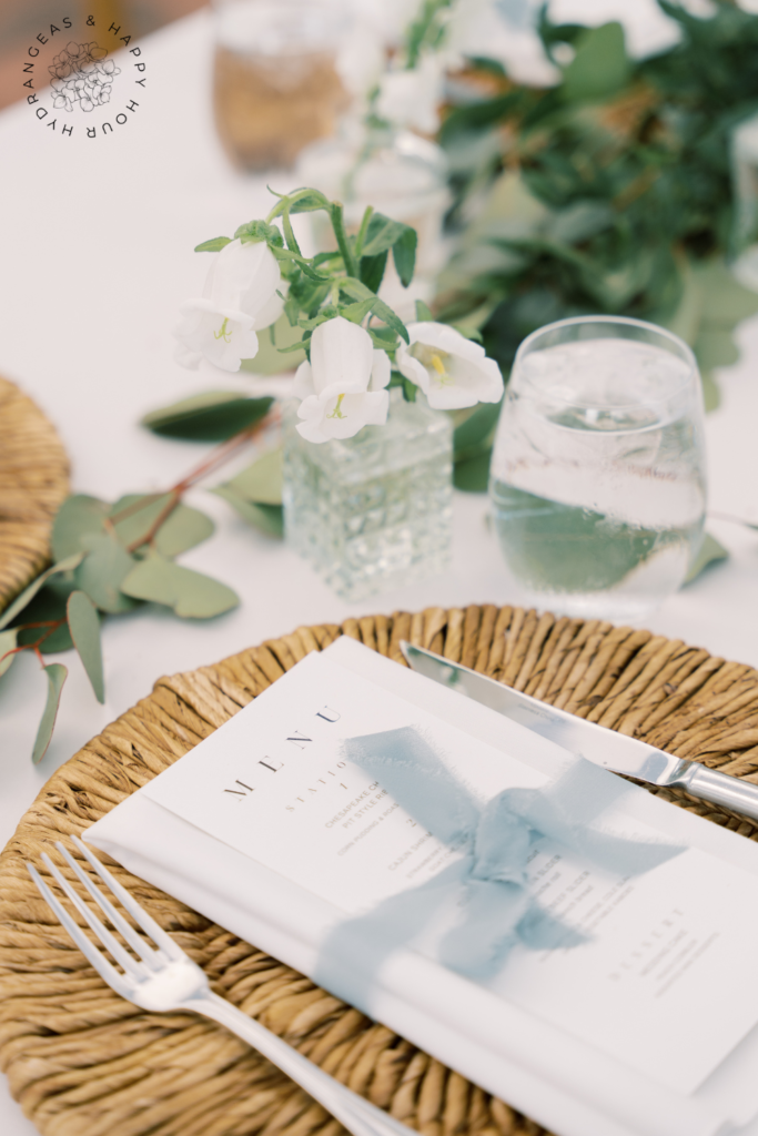
- Menus on the table will help your guests navigate the buffet line or the food stations and know what to expect.
How to Choose the Right Signs for Your Wedding
Choosing the right wedding signs has a lot to do with your wedding theme and overall aesthetic. From matching them to your theme to figuring out the best placement, a few simple decisions can help tie everything together. Here’s a quick guide to help you choose the perfect signs for your wedding day.
Matching Signs to the Wedding Theme
Choosing signs that match your wedding theme is key to creating a cohesive look. Whether you’re going for coastal, rustic, modern, minimalist, or something else entirely, your signs should reflect that style. For a rustic theme, wood or chalkboard signs with hand-lettering fit perfectly. If you’re leaning toward something modern, acrylic or metal signs with sleek fonts might be more your vibe. Minimalist weddings can keep things clean with simple fonts and neutral colors. No matter what style you choose, make sure your signs blend in seamlessly with the overall feel of the day.
We used a lot of neutral and white and accents of coastal themed colors and florals when selecting signs for the wedding. This matched our theme perfectly.
Color Palette and Material Selection
Your color palette and materials play a big role in how your signs will look. Sticking to your wedding colors for the text and background can help everything feel cohesive. Materials are another big consideration — wooden signs give off a natural, earthy vibe, while acrylic or glass feels sleek and contemporary. Think about how the materials will look with your venue and overall decor. Also, make sure the text contrasts well with the background so guests can actually read the signs, especially in low lighting.
Placement and Size Considerations
When it comes to placement, think about where your guests will need information most. Welcome signs should be placed right at the entrance, seating charts near the reception area, and table numbers, of course, at each table.
The size of the sign also matters — larger signs are easier to spot (like our seating chart), but you don’t want them to be overwhelming. Smaller signs are great for table numbers or little messages, but make sure they’re still legible from a distance. Think about the flow of the day and how your guests will move through the space, placing signs where they’ll be the most helpful.
DIY Wedding Signs vs. Renting or Buying
Deciding between DIYing your signs or renting or buying comes down to your budget, time, and skill level. We did a mix of DIY and purchasing from others. If you’re crafty and have the time, DIY signs can be a fun project and a great way to add a personal touch to your wedding. There are plenty of tutorials and templates available online to help. On the other hand, renting or buying ensures that everything will look polished and cohesive, especially if you’re going for more complicated designs.
DOWNLOAD A COPY OF OUR WEDDING PLANNING CHECKLIST HERE!
Wedding Sign Trends
When it comes to wedding signs, the options are constantly changing, and there are a few trends that are especially popular right now.
One of the biggest trends is calligraphy and hand-lettered styles. Whether it’s done by a professional or with a DIY touch, this style adds a personal, elegant feel to signs, making them not only functional but also a beautiful part of the decor. You’ll see it on everything from welcome signs to seating charts, and it works for almost any wedding theme.
For modern weddings, neon signs are very popular. These bold, glowing signs are perfect for adding a fun, contemporary touch. Couples love using them for unique phrases, their names, or even just a fun “Let’s Party” over the dance floor. Neon signs also double as amazing backdrops for photos.
Finally, personalized signs are a great way to create keepsakes that you can hold onto long after the wedding. Whether it’s your names and wedding date on a welcome sign or a custom message, these signs add a special touch to the day and make for meaningful mementos you can display in your home after the wedding.
Pin for Later 📌
What to Consider
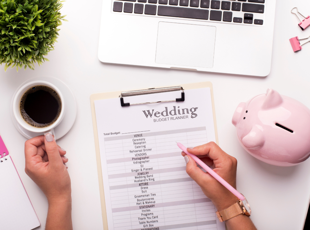
When planning your wedding signs, budgeting is a good place to start. Costs can add up depending on the materials, size, and whether you’re hiring a professional or going the DIY route, so it’s helpful to figure out how much you’re willing to spend early on.
Next, estimate how many signs you’ll need — think welcome signs, seating charts, table numbers, bar menus, and any directional signs for guests. For the best guest experience, make sure the fonts are easy to read, and the signs are large enough to be seen, but not overwhelming. Placement is key too — put signs where guests naturally look for information. If your wedding is outdoors, don’t forget to consider weatherproofing your signs. Materials like acrylic or laminated paper can stand up to wind or rain, so your signs stay intact no matter the forecast.
Where to Buy or Create Wedding Signs
When it comes to finding the perfect wedding signs, there are plenty of options. You can order custom signs from popular sites like Etsy or Minted, where you’ll find a range of styles and materials. We purchased our table numbers signs, the template for the bar signs and the plans for the welcome sign on Etsy.
If you prefer something even more personal, hiring a local calligrapher is a great way to get unique, hand-lettered signs. For the DIY-savvy, there are tons of tutorials and templates online that can help you create your own signs with a personal touch.
If you’re looking to save some money, consider renting signs — it’s often more budget-friendly, especially for larger pieces like welcome signs or seating charts, compared to buying everything new. Check with your wedding planner or the wedding rental companies in your area for options.
Conclusion
Wedding signs may seem like a small detail, but they play a big role in making your wedding day both beautiful and organized and also add a bit of your personality to your wedding. From welcoming guests to helping them find their seats, the right signs can elevate the look of your event while also keeping things running smoothly. To make sure your signs are functional and match your theme, focus on clear fonts, the right sizing, and placing them where guests will need them most. And don’t forget to personalize! Whether it’s with a custom design, your favorite quote, or meaningful details, your signs can be a reflection of you and your wedding theme.
For more overall wedding planning tips, check out our wedding checklist blog and our wedding planning blog.
DOWNLOAD A COPY OF OUR WEDDING PLANNING CHECKLIST HERE!
Photo Credit to Sarah Murray Photography. Our amazing wedding photographer.

